Podcast Typography Poster
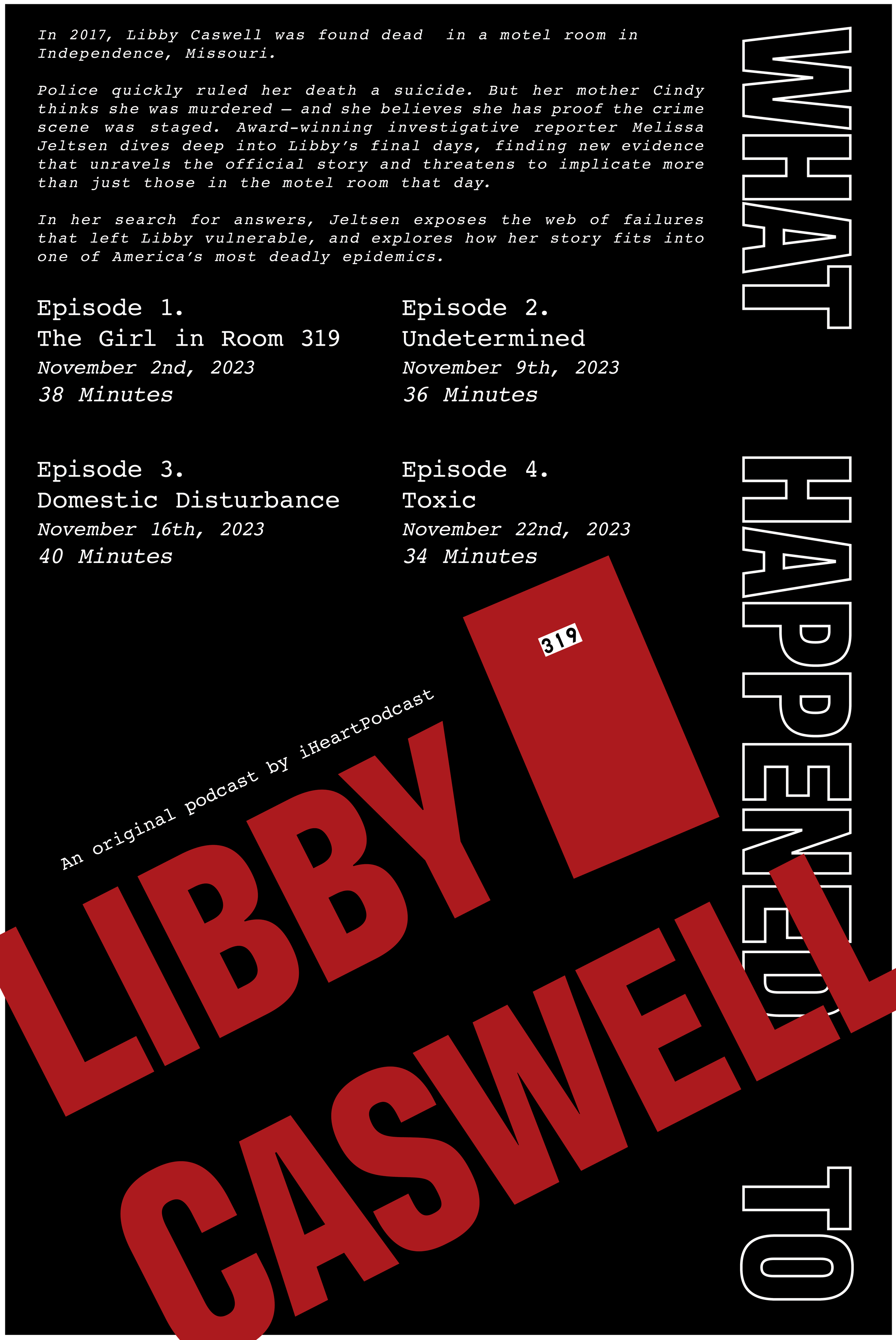
This poster was designed around the true crime documentary podcast “What Happened to Libby Caswell?” by iHeartPodcasts. The podcast focuses on the story of one woman and reveals details about her life and her suspicious death episode by episode. In order to translate this episodic format of the podcast into the poster design, the title was broken into segments and made to look layered onto each other; the idea is that the full picture is only possible when all parts are placed together. The typeface used for the title is Antarctican Headline, which resembles the bold sans serif fonts of newspaper headlines; like a newspaper headline, the size and boldness draws in a person's attention. This ensures that “Libby Caswell” is the most prominent element on the poster.
The design is intentionally black and white because the high contrast is loud and eye-catching. There is a strong hierarchy in the episode list at the top as the episode titles are highlighted as the most important element as the titles indicate the content of each episode. The smallest hierarchy is in the episode length, which is the least important information on this entire poster. Not only that, but the episode list lines up the invisible grid created by the title. This underlying grid is less obvious on the bottom, but the elements still line up. This poster captures the serious tone of the podcast through visual hierarchy and stark color contrast, as well as bold typeface choices.
Process
GDSN223
The title was cleaned up by adjusting the letters so they better line up with the segments and increases legibility.
The underlying grid was applied to the summary paragraph to keep consistency.
The gradient applied to the Spotify code was taken away as it is harsher than the gradients in the title.
The hierarchy of the episodes was pushed further. The episode titles were given a heavier font and overall leading was increased.


